Service map
The map is the product's front page: what is running, what talks to what, and which of it is unwell — drawn from telemetry that arrives on its own. Install the chart and generate traffic to supported workloads. Discovery depends on kernel and protocol support, collection permissions and the available traffic. The five-minute target is a Kubernetes CI gate, not a guarantee for every cluster.
The graph is derived from observed telemetry. It is not a manually maintained diagram.
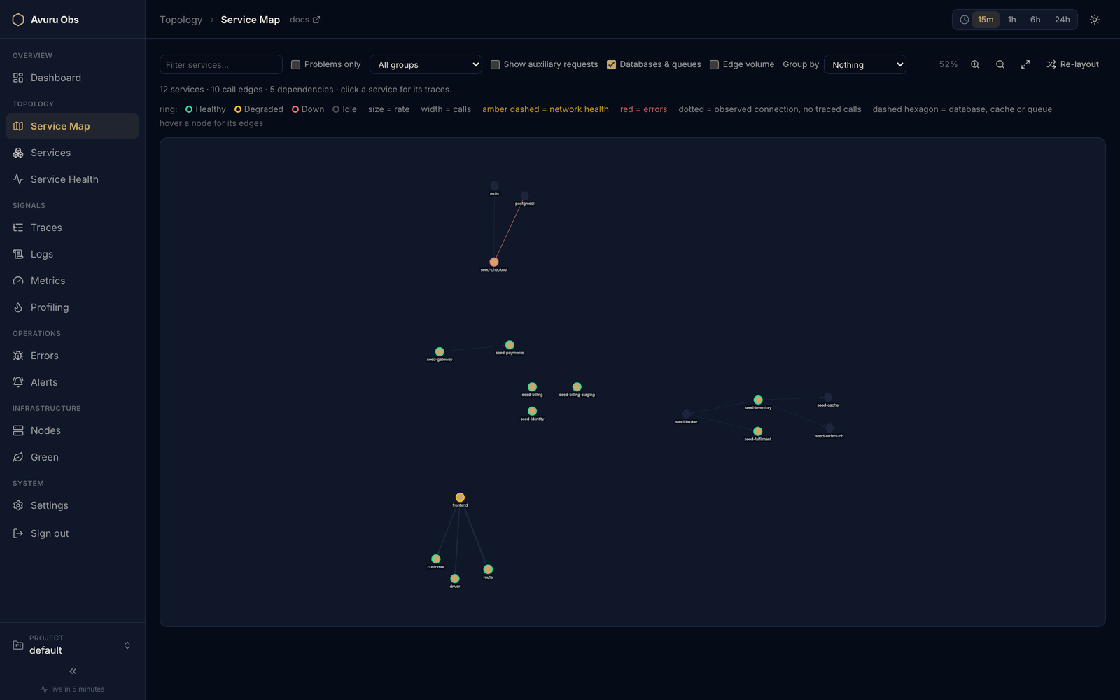
Product screenshot; your services, layout and available measurements will differ.
Try a complete investigation
Start with the slow checkout exercise: load a small synthetic dataset, follow checkout to its PostgreSQL dependency, then inspect the request's spans and correlated log. No database is required.
Where the picture comes from
Three sources, merged into one graph:
| Source | What it contributes |
|---|---|
| Trace spans | A caller's client span and the callee's server span become one edge, with call volume, error rate and the latency the caller experienced. |
| Kernel network flows (eBPF) | Connections nobody instrumented — services with no SDK still appear, and so do the bytes between them. |
| Exit spans | The databases, caches and brokers that send no telemetry at all. See dependencies, below. |
An edge drawn from flows alone is dotted: the kernel saw the connection, but no traced call sits behind it, so there is no rate or latency to report. Zero would be a lie — that path was not measured, not idle.
Reading the map
The map spends every visual channel on a different fact, so a node can say several things at once without any of them competing:
| Channel | Meaning |
|---|---|
| Ring colour | health status — green healthy, amber degraded, red down, grey idle or unmeasured |
| Size | request rate |
| Fill | identity — a plain application node |
| Shape | what kind of thing the node is (see below) |
| Edge width | call volume |
| Edge colour | plain, amber dashed for network trouble, red for application errors |
| Halo | gCO₂e, under the carbon lens |
A ring is never green by default. A service the health rollup has not measured stays grey: an unobserved service must not read as a healthy one.
Shapes say what a node is
- Hexagon — an application.
- Dashed barrel — a database, cache or message broker.
- Diamond — a service-mesh proxy or gateway. Hidden by default; see mesh hops.
- Hollow outline — a peer seen in traffic that has never reported anything.
Shape is a separate channel from colour on purpose: adding a kind of node never costs the map a colour it was already using.
Dependencies that never report
PostgreSQL, Redis and Kafka carry no SDK and no sensor. Left alone, a service that spends most of its latency in a database is drawn as a lonely hexagon with nothing to explain it — and four services sharing one cache is a blast radius nobody can see.
Avuru Obs derives them from the exit spans of the services calling them. No extra agent, no extra storage, nothing to switch on. Where protocol capture is supported, the eBPF sensor can supply these spans. Otherwise, instrument the calling database client with OpenTelemetry. A network connection alone does not establish a database operation or its duration.
Each dependency node is named as a URI — postgresql://orders-db,
redis://session-cache, kafka://broker-0 — and its edges carry call volume,
error rate and the latency the caller measured. A broker is drawn from both
ends, so a queue is never a dead end: producer → broker → consumer.
:::note What we know, and what we don't A derived dependency gets no health verdict: we only see it through its callers. When calls to it fail, the edge turns red — which is exactly what we observed. Clicking one does nothing, because it has no traces of its own to open.
Plain HTTP calls to third-party APIs are deliberately not drawn. Admitting every one of them puts every CDN, auth provider and metrics endpoint on the map at once, which makes it less readable, not more. :::
Mesh hops are not dependencies
A service-mesh sidecar, waypoint or ingress gateway emits spans and exchanges
bytes exactly like an application. Left alone, every app → proxy → app call is
drawn as two dependencies, asserting a relationship between services that
never talk to each other.
Avuru Obs classifies those workloads as transport and hides them by default. Show mesh & gateways brings them back — the hub always reports them, so the toggle costs no refetch, and a mesh you cannot see is a mesh you cannot debug. The mesh has a screen of its own too, where the proxies are the subject rather than the noise.
How a proxy is recognised
Two ways, and the second only ever adds to the first.
By the labels your mesh writes. A gateway, waypoint or control-plane
component created through the Gateway API or by Istio wears a label saying so,
and the sensor carries a small fixed set of them on the spans it already
collects. A gateway you called public-edge is recognised on the strength of
that label, without you configuring anything.
By name, for everything else. The built-in list is deliberately narrow —
nothing generic like *-gateway or *-proxy, because a false positive erases a
real service from the map, which is worse than the noise it removes. Add your
own patterns through the hub's topology configuration.
A label can only promote a workload to transport, never demote one. With a
sidecar there is no label to read at all: the proxy is a container inside the
application's pod and wears the application's labels, so absence proves nothing
and names remain the answer there. And the applications list in your topology
configuration still overrides both — an override a signal could defeat would not
be one.
The dependency underneath
Hiding the hop removes the false claim. It does not, on its own, restore the true one: with the proxies gone, a fully meshed estate is a set of disconnected nodes.
So the hub reads each trace's own parent chain — the callee's span, its
parent, and its parent — stepping over the proxies until it reaches the
application that actually made the call. That edge is drawn like any other
dependency, and hovering it names the proxy it came through (via istio-proxy).
The count line says how many edges were recovered that way.
Per-trace ancestry is what makes this safe. Pairing a proxy's inbound edges with its outbound ones in aggregate would invent a cross-product of calls nobody made — a proxy with four callers and five backends has twenty possible pairs and no way to tell which twenty happened. Following one span's parents gives exactly one caller per call.
:::info One request, drawn once
A recovered app → app edge and the two hops it came from describe the same
requests. The toggle therefore swaps representations rather than stacking
them: hidden mesh shows the dependency, shown mesh shows the hops. You never see
both, and the traffic is never counted twice.
:::
Boundaries
Group by draws a labelled container around each namespace or each service group. Past about forty nodes an ungrouped graph is a hairball, and you know your estate as namespaces or as groups — not as an undifferentiated cloud.
Namespaces come from the same resolution the health board's auto-grouping uses, so a box on the map and a group on the board can never disagree about where a service lives. A service that declares neither is drawn outside every boundary rather than swept into an invented "other".
Peers you have not instrumented yet
An edge whose far end never sent telemetry used to be thrown away — a graph edge needs two nodes, and only one existed. Those endpoints are now drawn as hollow outlines, counted apart from services, and carrying no metrics because there are none.
It is often the most interesting thing on the screen: it is the part of your estate nothing else can see. Each one is a candidate for the next thing to instrument.
:::note Not labelled "external" Naming the far end of a connection that leaves the cluster needs a per-address attribute on the flow metric, and the sensor deliberately does not collect one — per-IP-pair cardinality is expensive and was a real defect we fixed. So the map says undetected, which is what we know, rather than external, which would be a guess. :::
Working the map
- Hover a node to focus its neighbourhood: everything else fades, its edges thicken and reveal rpm, p95, error rate and RTT with a mid-line arrowhead for direction.
- Hover an edge for the fuller tooltip — failed connections and flow bytes.
- Edge volume labels every edge at once, for when the question is which of these paths carries the traffic.
- Click a service to open its traces.
- Filter by name, by group, or to problems only.
- Re-layout to escape a tangled arrangement; zoom and fit with a live percentage beside them.
Every filter and toggle lives in the URL. A map showing exactly what you are looking at is a link you can paste to a colleague — that is a product feature, not an accident.
Limitations
- Collapsing follows at most three chained proxies. A sidecar mesh interposes two proxy spans and ambient mode up to three; a deeper chain than that is not followed, and its hops stay hidden rather than being drawn as dependencies.
- Flow-derived edges carry bytes, not rates. They have no traced call to measure, so they show volume and no latency.
- Derived dependencies collapse by target, not by destination. Every topic on one broker is one node: the map's subject is the dependency, and per-topic detail belongs on a screen with room for it.
See also
- Network health — per-edge RTT and failed connections on these same edges.
- Service health — where the status rings come from.
- Core concepts — how the signals fit together.